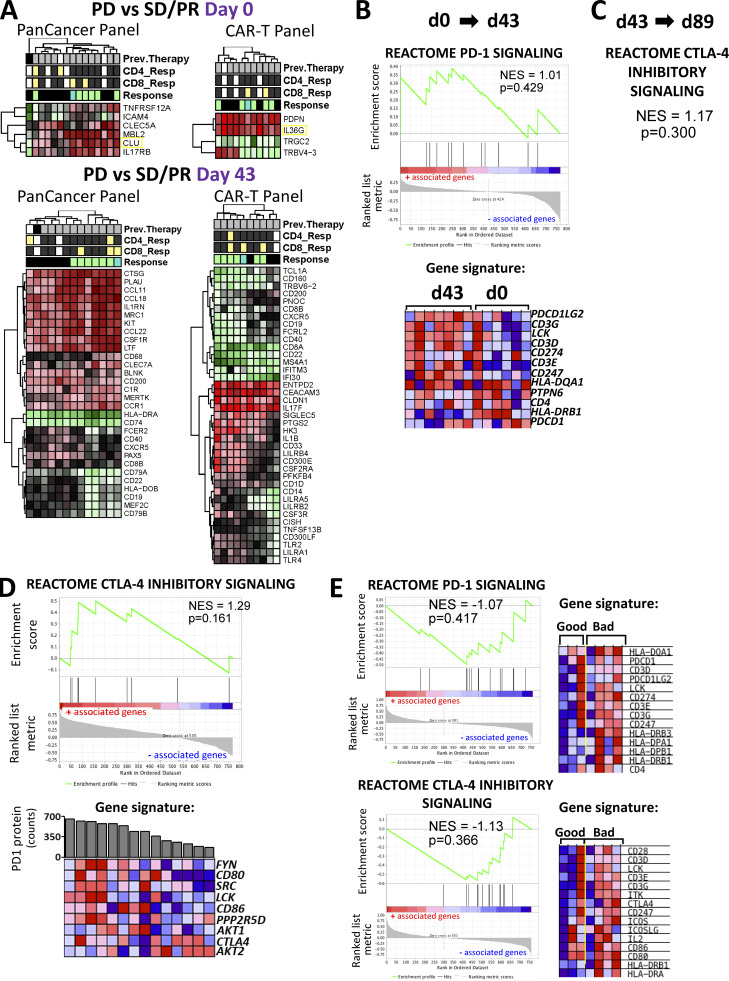
Figure S4.
Differential gene expression and immune checkpoint pathway associations in circulating lymphocytes and tumor/TIL samples. (A) Heatmaps for differentially expressed genes. Shown are heatmaps for differentially expressed genes between clinical response groups that were profiled using the PanCancer Immune Profiling and CAR-T Characterization panels in baseline and d43 circulating lymphocytes. Differential gene expression analysis was conducted using the limma R package as described in the Materials and methods section. Hierarchical clustering of DEGs was conducted using the pheatmap R package. The threshold for DE genes was set to fold change ≥1.85 and P value ≤0.05. Relevant phenotypic patient information associated with each lymphocyte sample is illustrated above the heatmaps. (B) PD-1 signaling pathway enrichment changes from d0 to d43 circulating lymphocytes. Shown is a GSEA plot and associated gene signature for the PD-1 signaling pathway. This figure comes from the same set of analysis and is analogous to the CTLA-4 GSEA plot in Fig. 8 C. (C) CTLA-4 pathway enrichment changes from d43 to d89 circulating lymphocytes. Shown are statistical parameters (NES and P value) for the CTLA-4 inhibitory signaling pathway. This figure comes from the same set of analysis and is analogous to the PD-1 GSEA plot in Fig. 8 D. (D) Results from the GSEA correlation-based enrichment analysis, which used the numeric PD-1 protein expression levels as a continuous phenotype. d43 and d89 (omitting baseline samples) circulating lymphocyte expression sets were used for this analysis. Shown is a representative GSEA plot and heatmap for genes involved in the CTLA-4 inhibitory signaling pathway, which positively correlated with PD-1 protein expression (shown as bar graph above the heatmap) in patient lymphocytes. (E) Immune checkpoint pathways associated with clinical outcomes in tumor biopsies. Shown are GSEA plots for PD-1 signaling and CTLA-4 inhibitory pathways enriched in tumor biopsy specimens from unfavorable (bad) clinical outcome patient groups. The associated gene signatures are presented in the form of heatmaps next to GSEA plots. Heatmaps in B–E show the clustered genes in the leading-edge subsets for each pathway category. Gene expression values are represented as colors, where the range of colors (red, pink, light blue, dark blue) shows the range of expression values (high, moderate, low, lowest). Prev., previous.

