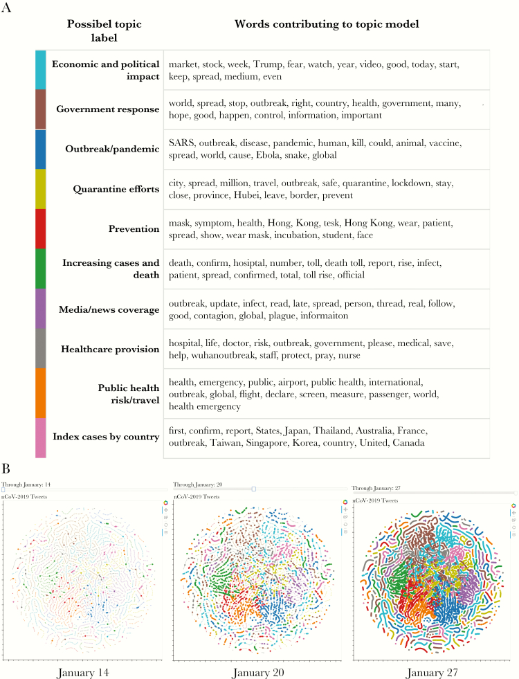
Figure 5.
(A) The 15 terms (in order of weighting) that contributed to each abstract topic with their potential theme labels. The topics are ordered by frequency. Colors for each topic correspond to those in B. Topic labels were assigned by the authors. (B) A t-distributed Stochastic Neighbor Embedding (t-SNE) graph (17) (which embeds high-dimensional data into a 2-dimensional space where similar tweets are grouped together) that visualizes the topics in A as labeled by color and how they change over time. The full interactive visualization is available at https://ssaleh2.github.io/Early_2019nCoV_Twitter_Analysis/; please note the visualization is slow to load. Each node represents an individual tweet, and only tweets posted through the day highlighted on the slider are shown in the foreground, whereas all tweets in the study period are shown in the background. Hovering over a node will show the tweet text and the day it was posted. Depicted here are 3 screenshots for January 14, 2020 (day 0), January 20, 2020 (day 6), and January 27, 2020 (day 13).

