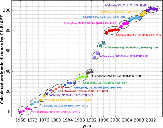
Fig. 3.

Antigenic clustering over the past four decades (1968–2014). The X-axis illustrates different years, while the Y-axis illustrates the predicted antigenic distance. Each spot represents the dominant strain of the circulating year, whose size is proportional to the logarithm of the strain numbers in that year. Strains with similar antigenicity are grouped into one antigenic cluster and named according to the first dominant strain in the first year of the cluster. Within each cluster, the antigenic distance was calculated between the dominant strain of each year and the representative strain of the cluster, whereas the antigenic distance between the two neighbouring clusters was calculated based on the representative strain.
