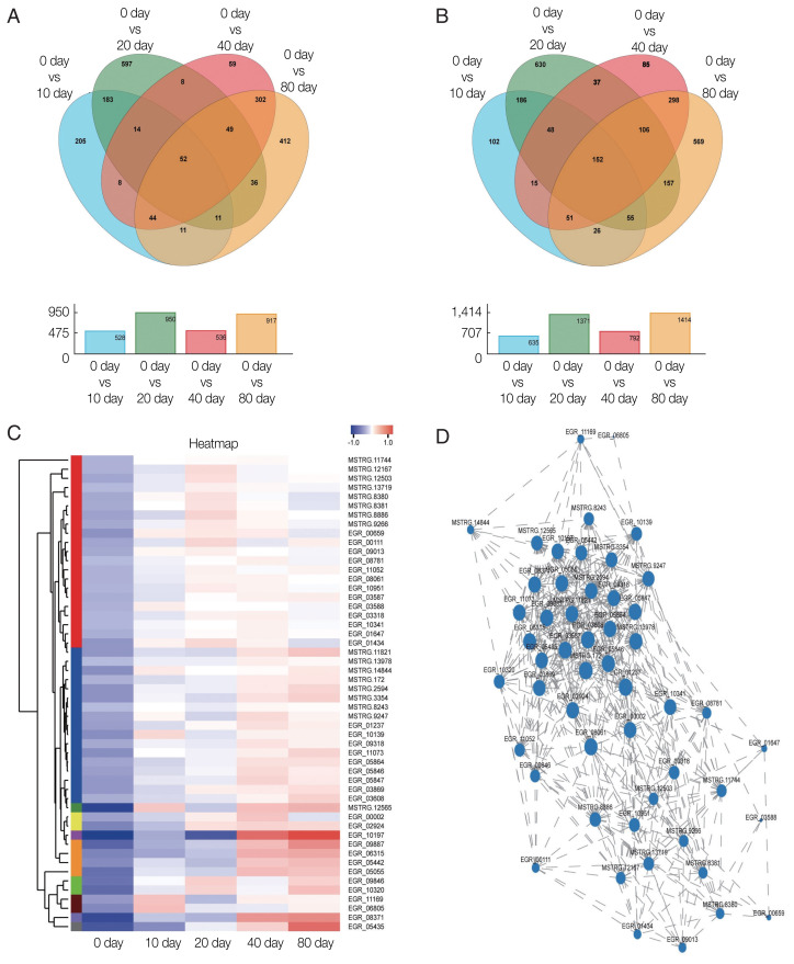
Fig. 3.
Transcription profiles of significantly differentially expressed genes. Venn diagram showing significantly (A) up-regulated DEGs and (B) down-regulated DEGs. (C) Hierarchical clustering map of 52 up-regulated DEGs showing overall TPM. log10 (TPM+1) values that are scaled and clustered. Red denotes up-regulated genes and blue denotes down-regulated genes. The upper clamps are sample clusters. The closer two sample branches are, the closer expression pattern of all genes in the two samples. (D) Correlation among 52 up-regulated DEGs. A node represents a gene. Lines between nodes represent a correlation between the levels of gene expression. The larger a node, the more a gene is correlated with other genes.

