Figure 3.

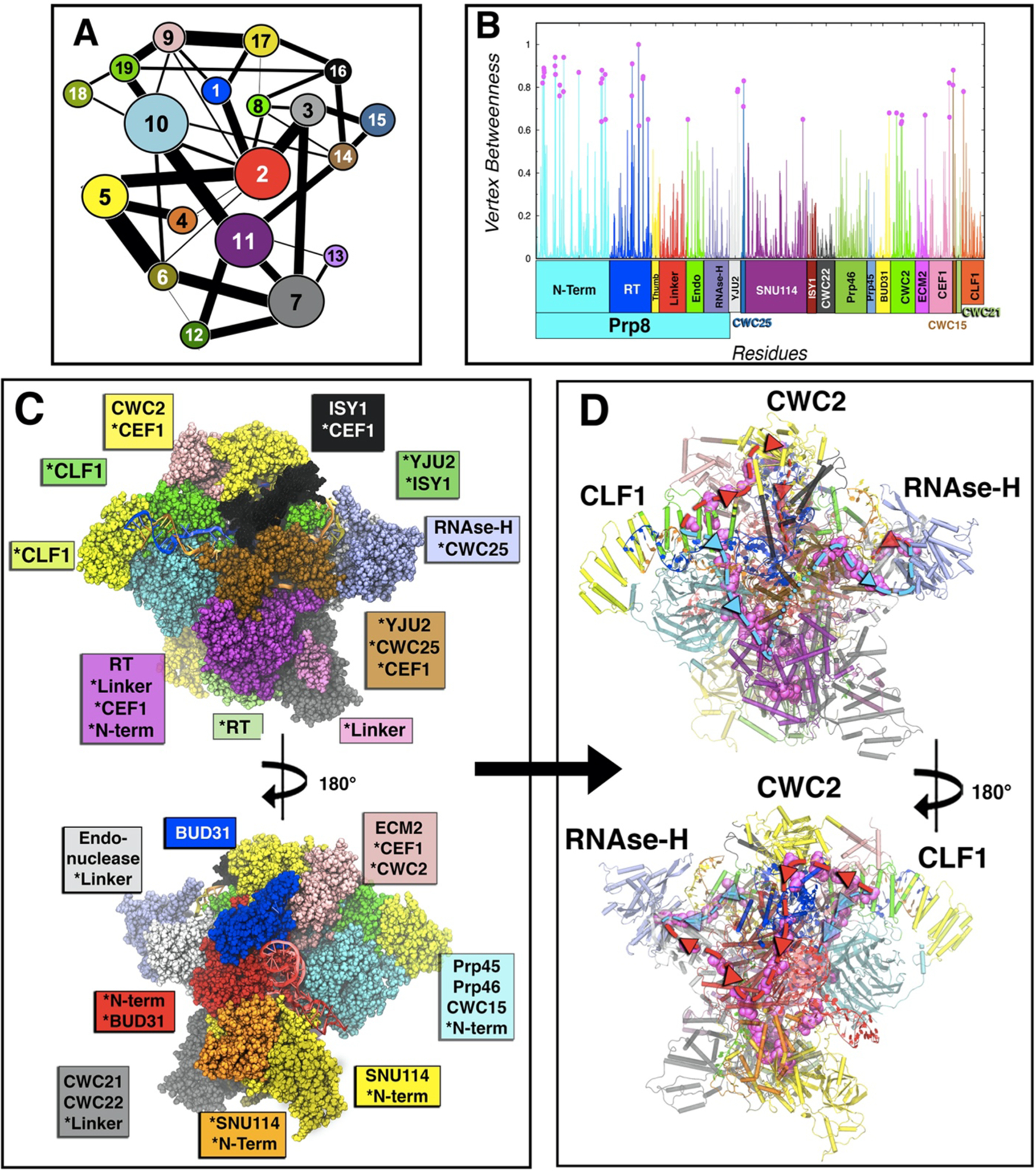
Community network analysis of the spliceosome. (A) 2D representation of the community network. The connecting links have a width proportional to the sum of all edges betweenness connecting two communities, thus measuring the corresponding intercommunities’ communication flux. (B) Normalized per-residue node betweenness (line) color coded by protein domains as in Figure 1, and points with betweenness more than 0.6 in magenta. (C) 3D-structure (front and back) of the community network, color coded with the same color of the 2D graph. Asterisks indicate domains or proteins when spread in various communities. (D) Spliceosome communication pathways (back and front). The residues with node betweenness higher than 0.6 are highlighted in magenta, thus displaying the two principal routes (path I in light blue and path II in red) for the communication flux through which most signaling occurs. In cartoon are depicted the communities with the community color code.
