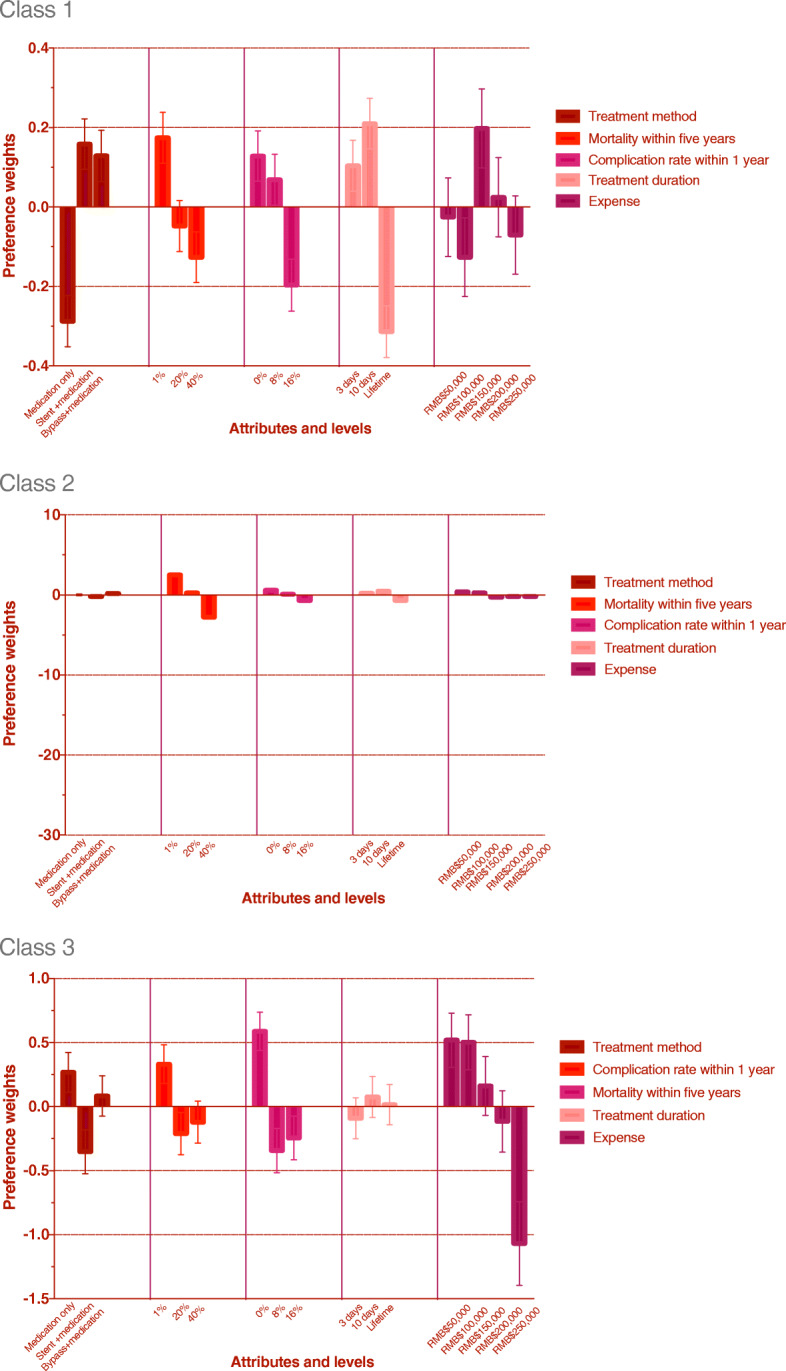
Fig. 3.

Tthe visual presentation of estimated preference weight for three classes. The dark red bar(first group ) indicates the preference weight of treatment method. The bright red bar(second group ) indicates the preference weight of mortality rate within five years. The light purple bar(third group ) indicates the preference weight of complication rate within one year. The pink bar(fourth group ) indicates the preference weight of treatment duration. The dark purple bar(last group ) indicates the preference weight of expense.  Treatment method.
  Mortality within five years.
  Complication rate within 1 year.
  Treatment duration.
  Expense
