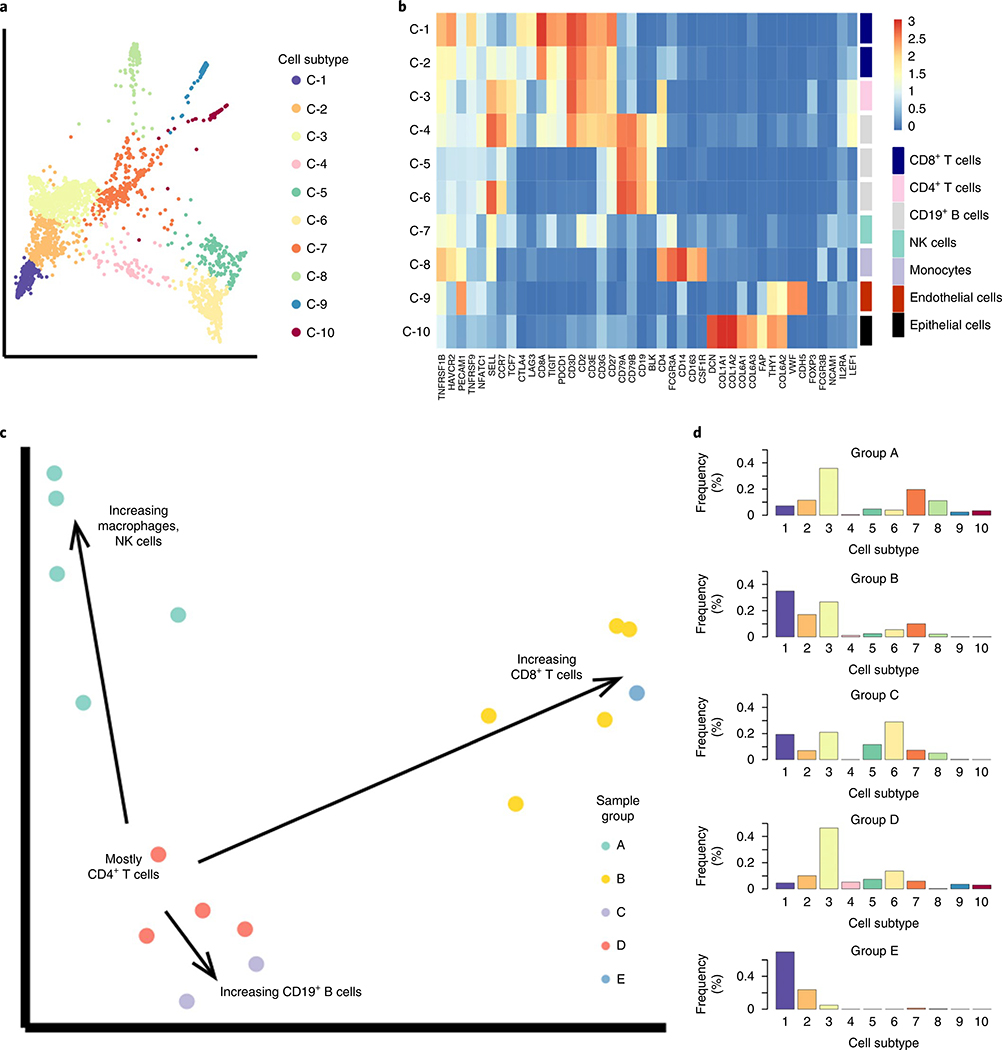
Fig. 5 |. PheMD applied to single-cell RNa-seq data of 17 melanoma samples (nontumor cells only) highlights heterogeneous immune profiles among different patients.
a, PHATE cell-state embedding colored by cell subtype. b, Heatmap showing mean rNA expression values of each cluster, colored by a log2 scale. c, Diffusion map embedding of samples (colored by group assignment) revealing multiple trajectories that represent increasing relative frequency of selected cell populations. d, Summary histograms, each representing the bin-wise mean relative frequency of cell subtypes for all samples assigned to a given group. The sample IDs (as assigned in the original dataset published by Chevrier et al.3) of all samples in each inhibitor group can be found in Supplementary Table 6.

