
FIGURE 3:
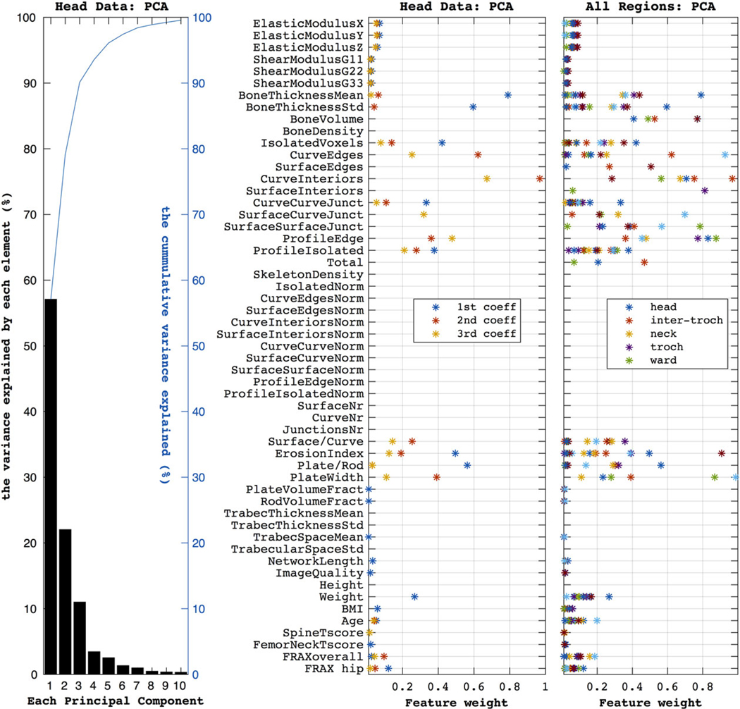
The first subplot (on the left) shows the components produced by the PCA when using the head data. The first three components explain ~95% of the variance (as shown by the blue line). The second plot shows how much each feature weighs in producing the three most important principal components (accounting for ~95% of the variance) for the head dataset. Similarly, the third subplot summarizes the PCA weights over the five anatomical regions, as color marked in the legend.