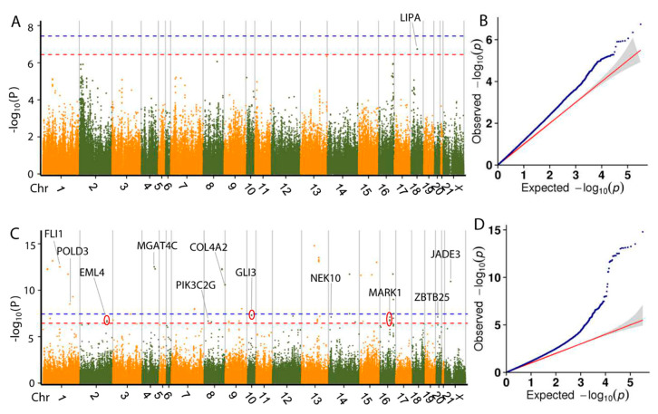
Figure 5.
Manhattan plots and Q-Q plots of GLM-based GWAS for the dressing out percentage (A,B) and slaughter liveweight (C,D). Negative log10 p values of the filtered high-quality SNPs were plotted against their genomic positions. The dashed lines of orange and blue indicate a 10% and 1% genome-wide Bonferroni-corrected threshold, respectively. Red ellipses indicate that SNPs within the same ellipse share the nearest candidate gene.

