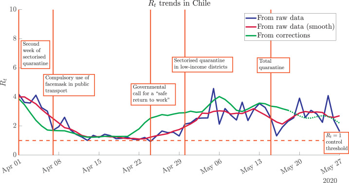
Fig. 4.
Effect of data processing on the evaluation of the spread of COVID-19 through Rt. The noisy raw data (blue curve) can be smoothed through mobile averages (dark red curve), but the trends are the same. A significantly different scenario is shown by the statistically-corrected Rt trend (green curve). Highlighted dates associated with iconic governmental actions in Chile: March 31st (second week of sectorised quarantine for the high-income districts of Santiago, capital of Chile), April 7th (compulsory use of facemask in public transport), April 24th (governmental call for a “safe return to work”), April 30th (sectorised quarantine –low-income districts of Santiago–), May 15th (total quarantine in Santiago). (For interpretation of the references to colour in this figure legend, the reader is referred to the web version of this article.)

