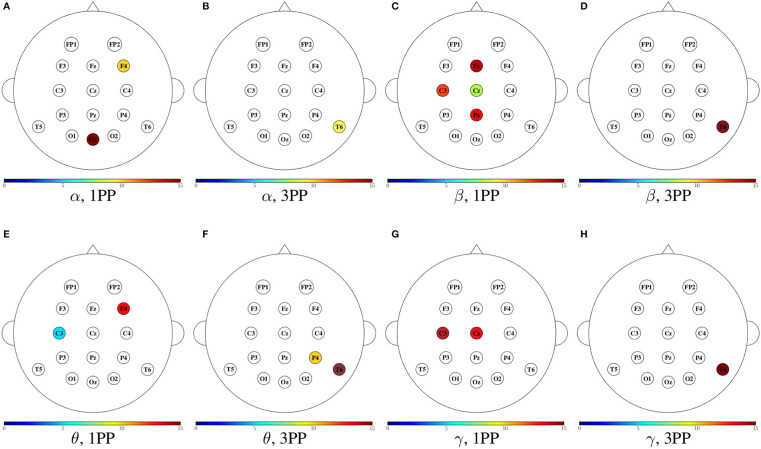
Figure 12.
Mean outdegree for both participants shown in color only at the sensors with an incremental trend in comparison to the other condition. For each frequency band, the heads to the left (A,C,E,G) show the cases when the outdegree in 1PP increased in comparison to 3PP, while the heads to the right (B,D,F,H) show those for which 3PP increased in comparison to 1PP.

