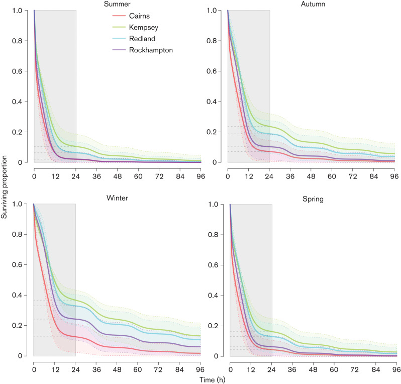
Fig. 2.
Simulated virus decay curves for 96 h after excretion at 3 : 00 a.m. Summer conditions are represented by the mean temperature of the hottest month and winter conditions are represented by the mean temperature of the coldest month. Autumn and spring are represented by the mean temperature of the first month of the season. The dashed lines represent the simulations with upper and lower standard errors of estimated parameters. The grey shaded area on the left side of each graph highlights the survival curve over the first 24 h.

