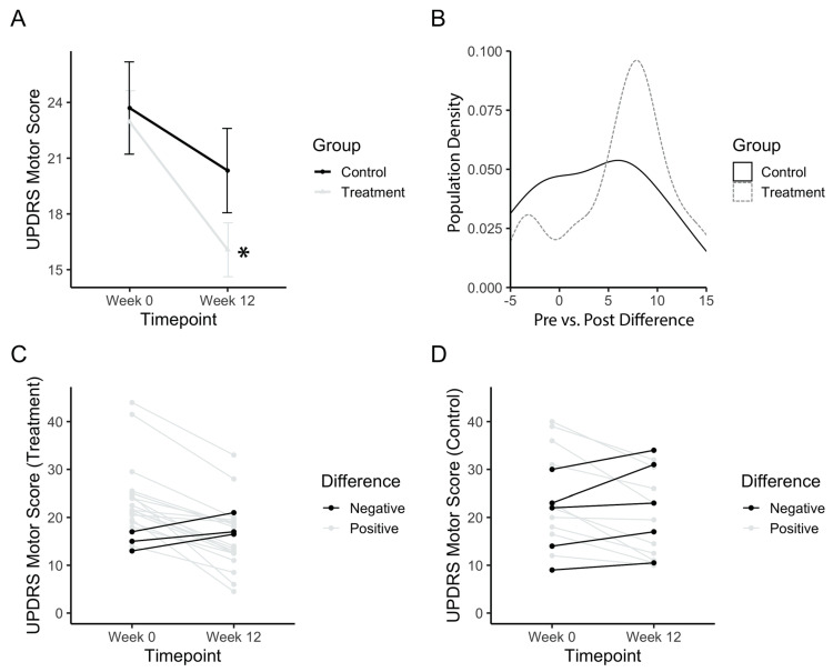
Figure 3.
UPDRS motor score after PAT. (a) Mean motor score before (Week 0) and after long-term treatment (Week 12). (b) Population density graph of the treatment and control group plotted based on the difference in pre- vs. post-treatment UPDRS scores. Numbers represent the value of the difference between pre-PAT score by post-PAT score. A positive difference indicates a decrease in UPDRS score, and an improvement in symptoms. The population density is the percentage of the total population with the corresponding difference score. (c) Individual plots for UPDRS scores for the treatment group. (d) Individual plots for UPDRS scores for the control group. Error bars represent standard error. Asterisks indicate a significant change (p < 0.05). Higher values in scores indicate greater disability.

