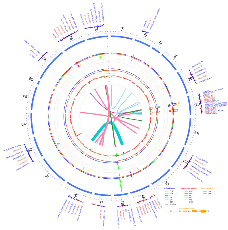
Figure 2.
Circos diagram of linkage and QTL map developed using pooled phenotypic data (average of all environments) of doubled haploid population produced from the cross AAC Innova x AAC Tenacious. The outermost circle/track shows the 21 chromosomes (1A -7D) arranged in a clockwise direction with selected QTL-linked/flanking markers in 0.1X scale (cM). Three inner circles and line connections in the middle represent the mean LOD score (second track from outside), % phenotypic variation (R2) explained (third track from outside), additive effect (AE) (fourth track from outside) of individual QTL and epistatic effect (AA) of digenic QTL x QTL interactions (line connections in the middle) for different measured traits. In the second and third tracks from outside, blue lines show a LOD threshold of 2.5 and R2 threshold of 10%, respectively. QTL confidence intervals are shown in different colors beneath the QTL scans in second track from outside. LOD, R2 and AE peaks of different traits are represented in different colors as shown in the effect legends in the lower-right corner of the diagram. Three most significant and stable QTL identified were on chromosomes 2D and 4B. AA interactions between QTL pairs of the same or different linkage groups for each trait are represented in middle of diagram by line connections of different colors, as shown in the interaction legend in the lower-right corner of the diagram. Negative and positive AA interactions are represented by hollow and solid lines, respectively. The width of the line connections represent the strength of AA effect, as shown in the AA interaction scale in the lower-right corner of diagram.

