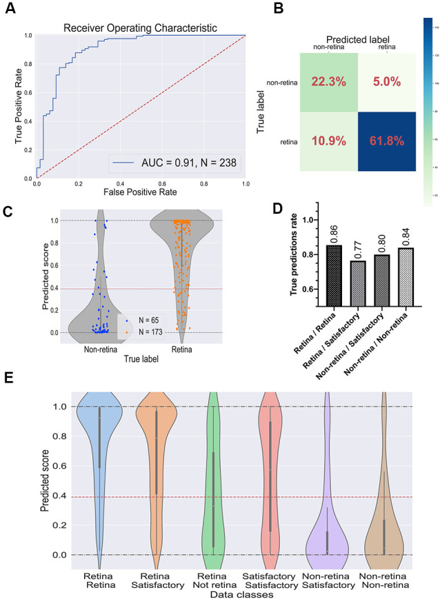
Figure 4.

Performance of the best convolutional neural network (CNN) on the test dataset. (A) Receiver operating characteristic (ROC) curve for the selected CNN on the test dataset. ROC-area under the curve value equals 0.91. (B) Confusion matrix for selected CNN. Values in the squares represent percentages of true negative, false positive, false negative, and true positive predictions. Color LUT shows the absolute number of images in each group. (C) Prediction scores for the test dataset; each dot represents a single organoid; the red line represents the threshold value for the classifier. (D) True prediction rates for each class of organoids with the CNN classifier. (E) Violin plots on all possible classes of organoids which can be assigned by combining the votes from two experts. The white dot in the center of each plot represents the median of the distribution; the boxes and the bars represent the first quartile and the upper/lower adjacent value, respectively; the red line is a classifier’s threshold.
