
Fig. 2.
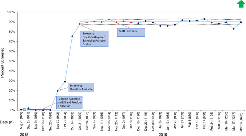
P chart representing the percentage of included patients screened for influenza vaccination each week. Red diamonds indicate a shift in the data. Green dashed line represents the goal line. LCL, lower control limit; UCL, upper control limit.
Official websites use .gov
A
.gov website belongs to an official
government organization in the United States.
Secure .gov websites use HTTPS
A lock (
) or https:// means you've safely
connected to the .gov website. Share sensitive
information only on official, secure websites.
P chart representing the percentage of included patients screened for influenza vaccination each week. Red diamonds indicate a shift in the data. Green dashed line represents the goal line. LCL, lower control limit; UCL, upper control limit.