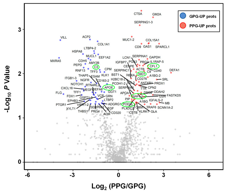
Figure 2.
Volcano plot of urinary proteomic data. Volcano plots are depicted with the fold change of each protein abundance and the p value was calculated by performing a Mann–Whitney U-test. The averages of the urinary proteomic abundance data of good prognostic group (N = 35) were compared with the averages of the data for poor prognostic group (N = 19). Red circles show 54 urinary proteins that have significant increases in PPG. Blue circles show 46 urinary proteins which have significant decreases in PPG. Gray circles are urinary proteins without statistical meaning. Green circles are previously released as urinary protein markers for glomerular injury or tubular injury.

