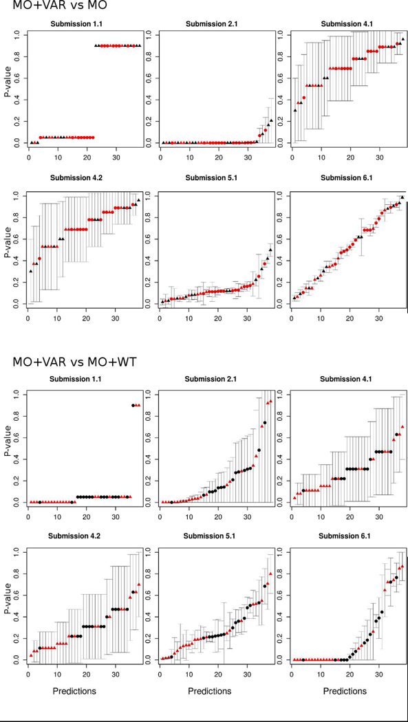
Figure 2:
Predicted p-values with their corresponding standard deviation for each experimental condition by group. The x-axis is from 1 to 38 and represents the predicted p-values for a particular position (sequentially ordered by the position on the sequence). The y-axis is the value of the predicted p-value.
Dot shapes represent the variant effect, with triangles for pathogenic and circles for benign. The color indicates the experimental p-value, red for p-value < 0.05 and black for p-value ≥ 0.05.

