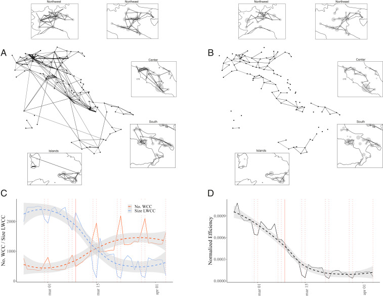
Fig. 1.
Connectivity of the Italian mobility network during COVID-19 epidemic. (A and B) Snapshots of the mobility network on two Mondays before and after national lockdown (March 9), that is, on (A) February 24 and (B) March 30. Nodes represent municipalities aggregated at the province level, and they all have equal size, whereas thickness of edges is proportional to their weight. Insets provide an outlook on different regions, where node size is instead proportional to the population of the province. (C) The temporal evolution of the network connectivity in terms of number of weakly connected components (No. WCC, red) and size of the giant connected component (Size LWCC, blue), measured on daily snapshots of the mobility network from February 23 to April 4; trends are significantly increasing (M-K: ; K-T: ; T-S: ) and decreasing (M-K: ; K-T: , ; T-S: ), respectively. (D) The temporal evolution of the global efficiency for the Italian mobility network from February 23 to April 4. Efficiency is computed according to ref. 15. We use the reciprocal of weights to model distances between nodes. The trend is significantly decreasing (M-K: ; K-T: , ; T-S: ). To visualize trends in C and D, we show a locally estimated scatterplot smoothing (LOESS) regression (dashed line) with 95% CI (shaded area), and highlight lockdown and weekdays with a solid and dotted vertical red lines, respectively.

