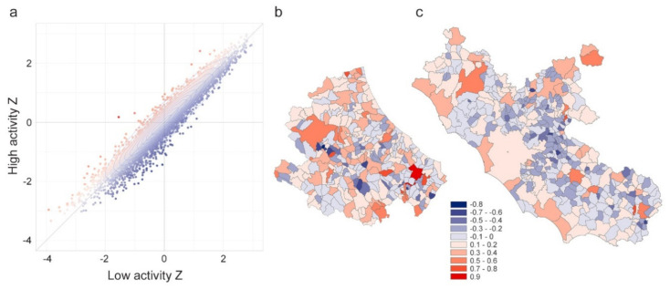
Figure 6.
Panel (a) include the scatterplot of the Zscores for low-activity time (x-axis) and high activity time (y-axis). The color of the points codes the difference y–x to diversify the municipalities where incoming commuters prevail over outgoing (red points) from municipalities where outgoing commuters prevail over incoming (blue points). Zscore difference for (b) Abruzzi and (c) Lazio regions, respectively.

