Figure 7.
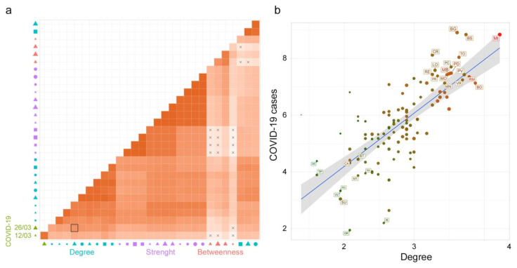
Correlation analysis. (a) The heatmap of Pearson’s correlation coefficients among all the variables: Social Network Analysis (SNA) metrics for the rescaled commuting network and subnetworks (with in and out commuters greater than 50, 100 and 1,000), and COVID-19 cases (at different times). The X symbol indicates a nonsignificant correlation. The red scale color indicates a positive Pearson’s coefficient value. In the x-axis legend, the symbol color represents the variable groups: COVID-19 cases (green), betweenness (red), degree (light blue) and strength (purple); the symbols: circle, square and triangle represent the directions in terms of in (circle), out (square), and none (triangle); the symbol size from smaller to bigger represents the networks variables (subnetworks with in and out commuters greater than 50, 100 and 1,000 and the whole network). (b) A scatter plot graph between Deg50 and COVID-19 cases (as of March 26 2020) in the logarithmic scale. The scale color from green to red is used to characterize the in-strength (from a lower to higher number of incoming commuters) of the node and the symbol size (from smaller to bigger) characterizes the node in terms of out-strength (lower to higher number of outgoing commuters).

