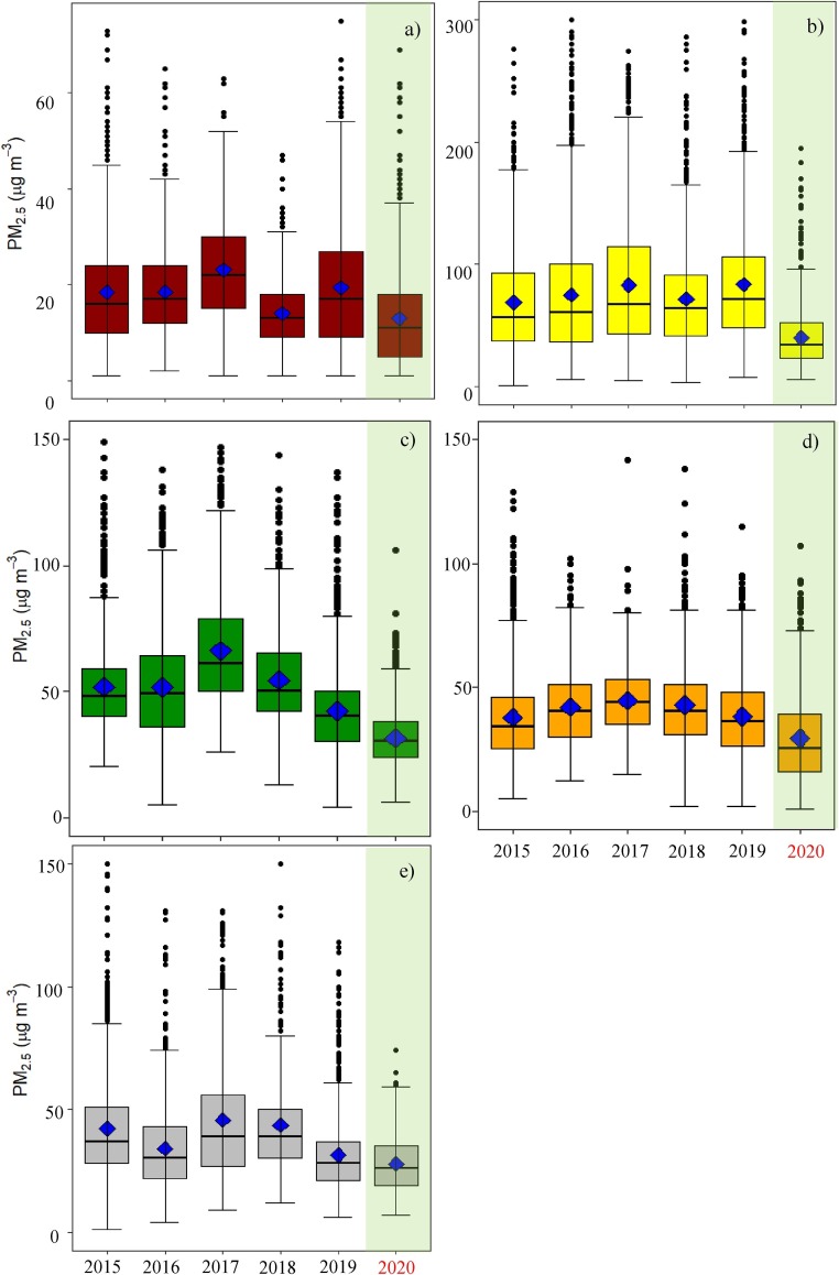
Fig. 3.
Variability of PM2.5 concentrations (μg m−3) during lockdown period (25 March to 11 May 2020) for (a) Chennai, (b) Delhi, (c) Hyderabad, (d) Kolkata, and (e) Mumbai. The plot represents the mean PM2.5 (diamonds), the median (horizontal bars in the centre of boxes), the 25th and 75th percentiles (the bottom and top edge of the boxes), and minimum and maximum concentration (the bottom and the top edge of the whiskers). The plot also shows extreme observations, which are much larger and lie above the rest of the data as black dots).

