
Figure 4: Select visualizations derived from various Bioconductor workflows.
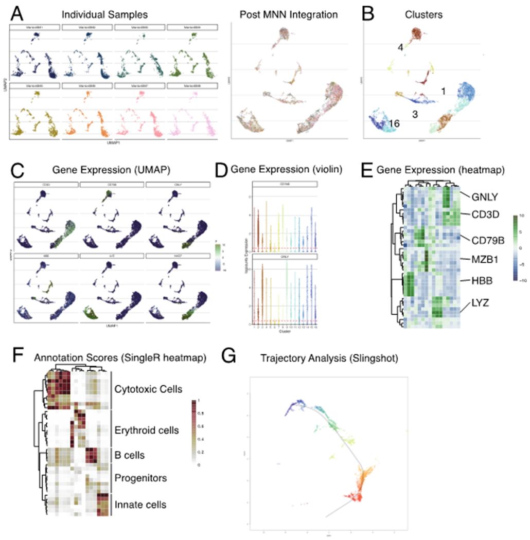
Various visualizations associated with preprocessing (blue boxes) and downstream statistical analyses (orange boxes). The example data set used throughout was generated as part of the Human Cell Atlas [21]). Details on the generation of these figures are described in our online companion book (https://osca.bioconductor.org)