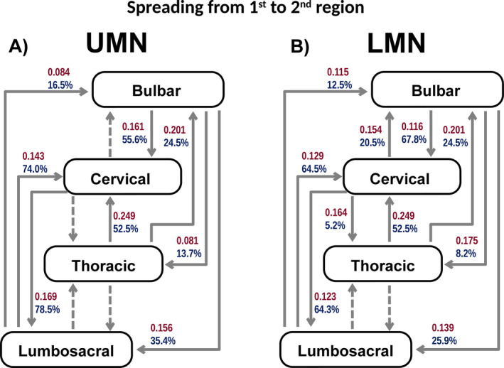
Figure 2.

A and B, Illustrates the spread from the region of onset to the 2nd region affected in UMN onset (A) and LMN onset (B). Arrows with red numbers represent a unit related to the spreading rate (months‐1), and arrows with blue numbers represent the proportion of patients progressing to the next region (cumulative %) derived from the fitting curve equations. Dashed arrows represent progressions for which a good statistical model (adequate curve fit) was not attained.
