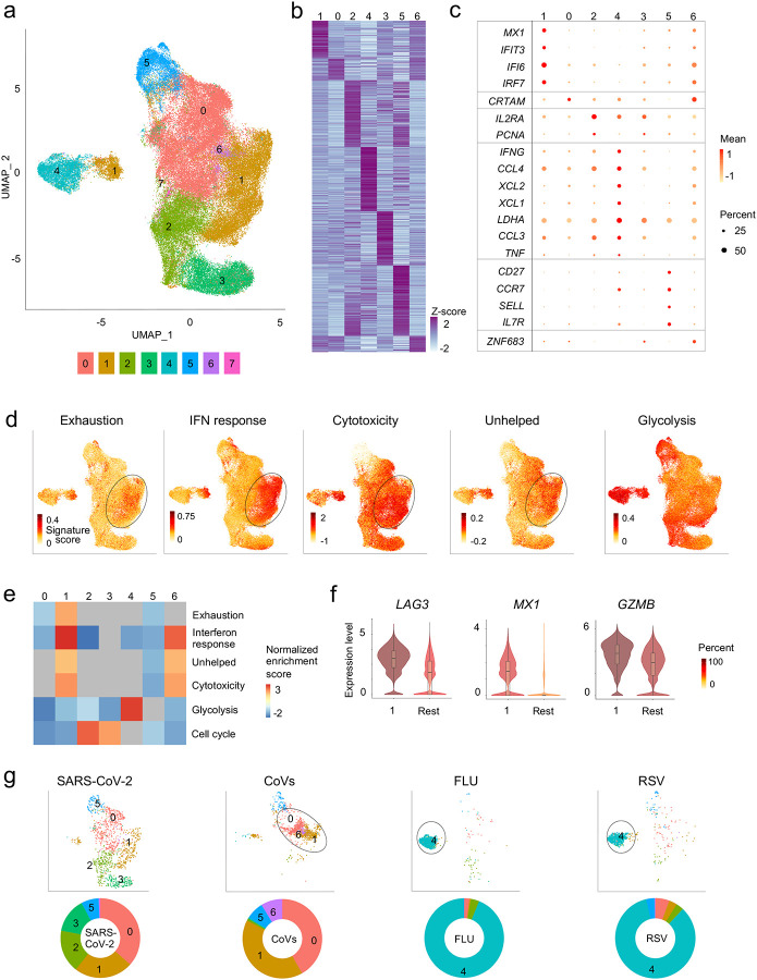
Figure 2. Virus-reactive CD8+ T cells show transcriptomic heterogeneity.
a, Uniform manifold approximation and projection (UMAP) analysis that displays single-cell transcriptomic landscape of sorted CD137+CD69+ CD8+ memory T cells following 24 hours stimulation with virus-specific peptide pools. Seurat-based clustering of single cells colored based on cluster type. b, Heatmap showing expression of the most significantly enriched transcripts in clusters 0–6 (see Extended Data Table 4, Seurat marker gene analysis - comparison of a cluster of interest versus all other cells). Shown are a subset of the top 200 transcripts that have an adjusted P < 0.05, log2 fold change > 0.25, and >10% difference in the percentage of cells expressing the differentially expressed transcript between two groups compared. c, Graph showing average expression and percent expression of selected marker transcripts in each cluster; cells in cluster 7 that comprise <1% of all cells are not shown (b,c). d, UMAP is illustrating exhaustion, interferon (IFN) response, cytotoxicity, ‘unhelped’, and glycolysis signature scores for each cell. e, Gene Set Enrichment Analysis (GSEA) for the indicated signature genes comparing each cluster with the rest of the cells. Heatmap shows summary of the normalized enrichment scores for each cluster. Gray color indicates that the signature does not reach statistical significance (P >0.05) in a given cluster. f, Violin plots showing expression of representative exhaustion, IFN response, cytotoxicity marker transcripts (LAG3, MX1, GZMB, respectively) in cluster 1 compared to an aggregation of remaining cells (Rest). The color indicates percentage of cells expressing indicated transcript. g, UMAPs are depicting CD8+ memory T cells for individual virus-specific pool stimulation conditions (top panel). Each group of virus-reactive cells was randomly downsampled to ensure equal representation, corresponding pie charts, displaying proportions of virus-reactive cells in individual clusters (bottom panel).

