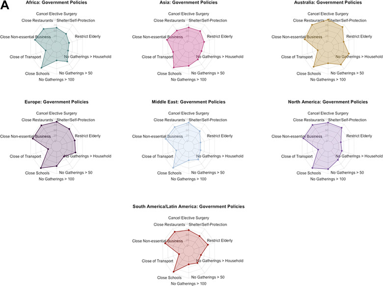
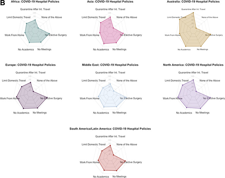
Figure 3.
A. Radar chart depictions of current COVID-19 government policies by geographic region: 10-sided (decagon) radar charts visually depicting cumulative percentage of responses verifying the enactment of a given COVID-19 government policy at the time of survey distribution. Queried policies are listed at the vertex of a given figure, whereby points falling on a vertex of the innermost decagon correspond to a cumulative total of 0% of survey responses received. Moving outward from one decagon to the next corresponds to a 25% increase in responses for a given category. B. Radar chart depictions of current COVID-19 hospital policies by geographic region: 7-sided (heptagon) radar charts visually depicting cumulative percentage of responses verifying the enactment of a given COVID-19 hospital policy at the time of survey distribution. Queried policies are listed at the vertex of a given figure, whereby points falling on a vertex of the innermost heptagon correspond to a cumulative total of 0% of survey responses received. Moving outward from one heptagon to the next corresponds to a 25% increase in responses for a given category.


