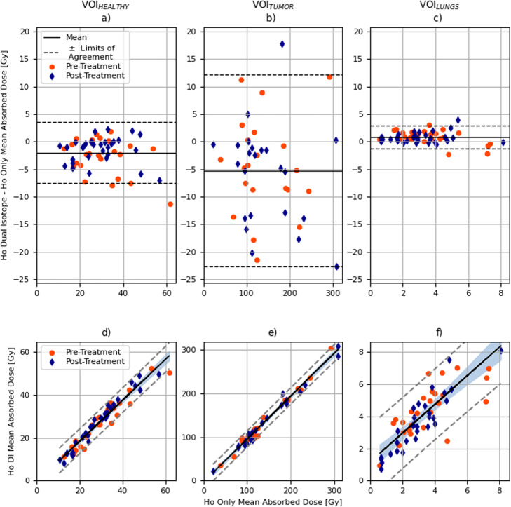
Fig. 4.
Bland-Altman plot (difference between mean absorbed dose recovered in 166Ho-DI and in 166Ho-only against mean absorbed dose in 166Ho-only) is depicted in the top row. Orange circles refer to pre-treatment dataset while blue diamonds to post-treatment. Mean of difference between absorbed dose recovered in 166Ho-DI and in 166Ho-only () is depicted by the black solid line, while black dashed lines define ± limits of agreement. Data in (a) refers to VOIHEALTHY, in (b) to VOITUMOR, and (c) depicts data referring to VOILUNGS. Linear correlation plot between 166Ho-only and 166Ho-DI with respect to the mean absorbed dose for VOIHEALTHY (d), VOITUMOR (e), and VOILUNGS (f), subdivided between pre-treatment (circles) and post-treatment (diamonds), is reported in the bottom row. The solid line depicts linear regression, while the dashed lines indicate the ± 95% confidence intervals

