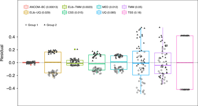
Fig. 3. Box plot of residuals between true sampling fraction and its estimate for each sample.
In the box plot, the lower and upper hinges correspond to the first and third quartiles (the 25th and 75th percentiles). The median is represented by a solid line within the box. The upper whisker extends from the hinge to the largest value (maxima) no further than 1.5 times Interquartile Range (IQR, distance between the first and third quartiles) from the hinge, the lower whisker extends from the hinge to the smallest value (minima) at most 1.5 times IQR of the hinge. Data beyond the end of the whiskers are called “outlying” points. N = 30 samples examined over two experimental groups (denoted by circles and triangles) and the data points are overlaid in each box. Text on the upper left corner indicates the color for each method and variances are provided within parenthesis for each method. The variability in sampling fractions is set to be large. An ideal box plot should display a narrow height (i.e., smaller variability) and samples from the two groups should be intermixed and not display any systematic separation. We note that all existing methods have larger variances compared with ANCOM-BC, and TSS has the largest variance. Except ANCOM-BC, UQ, and TMM, we see from the plot that circles and triangles are systematically separated, which indicates that ELib-UQ, ELib-TMM, CSS, MED, and TSS do not account for systematic bias due to differences in sampling fractions across groups.

