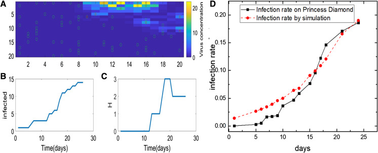
Fig. 3.
Plot of the simulation results. a The spatial distribution of individuals in different states, and the virus concentration in space, with the infected individual (I, red X) and the susceptible (S, green circle). The time course of the number of I (b) and H (c). d The simulated infection rate vs the real infection rate on the Princess Diamond. (Color figure online)

