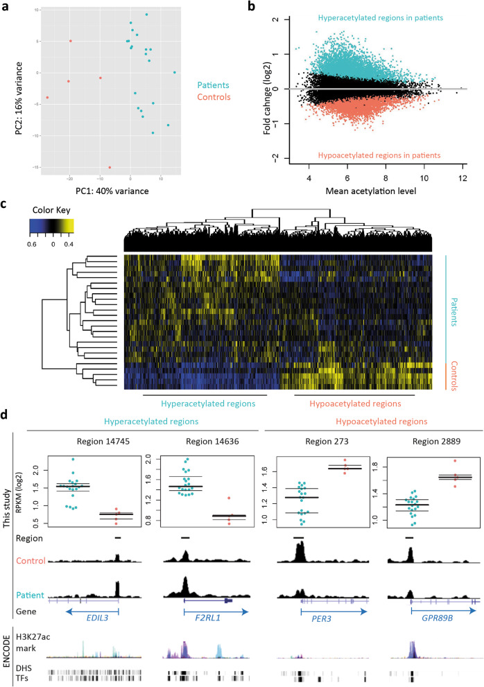
Fig. 1.
Differentially acetylated H3K27ac regions between patients and controls. a Principal component analysis (PCA) plot showing the clustering of patient and control samples based on H3K27ac profiles (using 500 regions with the highest variance). b MA plot showing the mean acetylation levels of all samples (x-axis) and the fold changes between two groups in the log2 scale (y-axis). Colored dots represent hyper (aqua)- and hypoacetylated (coral) regions in patients compared with controls respectively (adjusted p value < 0.05). c Heatmap depicts the clustering of samples based on all DARs acetylation levels. d Examples of DARs in the UCSC genome browser. Dot plots depict the acetylation level in patients (blue) and controls (orange). ENCODE = public ENCODE data default display. H3K27ac mark = ChIP-seq data of 7 cell types obtained from ENCODE. DHS = DNaseI hypersensitivity clusters in 125 cells. TFs = ChIP-seq data of 161 transcription factors

