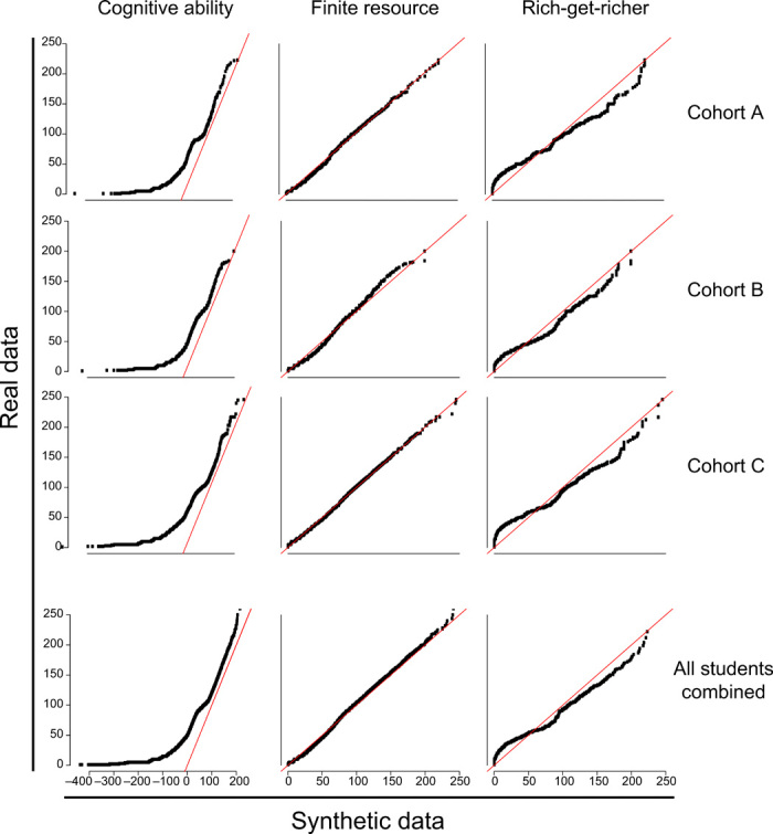
Fig. 3. QQ plots for the three parametric models.

Each plot compares a real dataset to a simulated population generated using a fitted model. The columns correspond to discrete normal, geometric, and zeta distributions, respectively. The top three rows each correspond to a single college-year cohort. The bottom row infers the distributions for the complete set of 156,712 students from all 28 colleges. Points close to the red line indicate that the quantiles of the simulated data are very close to the quantiles of the actual data, signifying that the model fits the data better.
