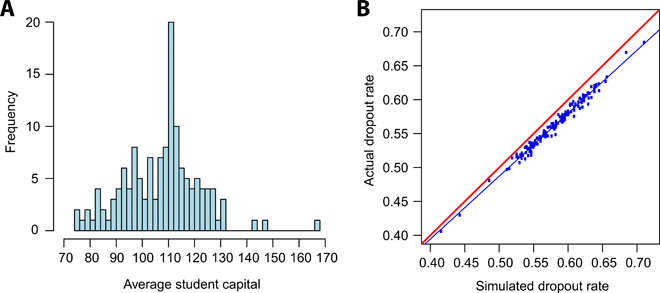
Fig. 4. Further analysis of the finite resource model.

(A) Histogram of average student capital. Each data value is the average student capital of a single college-year cohort. (B) Comparison of actual dropout rates and the dropout rates estimated by the finite resource model (n = 140). Each point corresponds to one college-year cohort. The red line corresponds to both values being equal. The blue line is the line of best fit.
