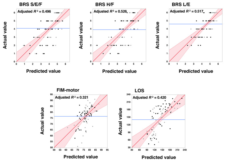
Fig. 2.
Scatter plots showing the actual measured values (vertical axes) and the predicted values derived from the parameter estimates of multivariate regression analyses (see Tables 2 and 3). Black dots represent data from patients with hemorrhagic stroke and gray dots represent data from those with ischemic stroke. Red lines with a slope of 1 indicate a perfect fit, i.e., where the predicted and actual values are identical. Reddish areas indicate the 95% confidence intervals. Blue lines indicate the mean of the actual values obtained.
S/E/F, shoulder, elbow, and forearm; H/F, hand and finger; L/E, lower extremity.

