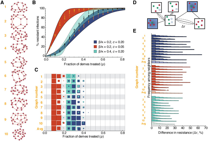
Fig 4. Dynamics of drug-resistant infections in populations consisting of networks of inter-connected demes.
A) Randomly generated population structures on which infection was simulated. Each node represents a deme (a well-mixed sub-population of individuals), and each edge indicates that infection can spread in either direction between those two demes. Ten example populations were selected out of 1000 total simulated, each with twenty demes randomly connected to three neighbors each, to represent a broad range of outcomes. B) Fraction of infections that are resistant in the entire population (y-axis) versus fraction of demes treated, ρ (x-axis). Each color represents a different parameter set (blue background—baseline, red background—lower cost of resistance, teal background—more between-deme connectivity). Numbers show data points for the ten example populations. The colored envelope is created by shading between sigmoidal curves that encompass all the data. C) For each population structure shown (y-axis) and each treatment level (x-axis), the proportion of simulations that resulted in robust coexistence between drug-sensitive and drug-resistant strains is shown (by the colored area of the box). Robust coexistence was defined as at least 80% of demes supporting both strains at frequencies above 10%. D) Differences in resistance levels (% of all infections that are with the drug resistant-strain) are measured between all pairs of directly-connected untreated demes. E) Histograms showing the distribution of pairwise differences in resistance for a given population structure. Lighter shaded histograms combine results from all population graphs. All simulations used kinetic parameters κ = 0.25/day, g = 0.1/day, and ϵ = 0.9, and pooled results from 100 simulations with different random allocation of treatment across demes. Pairwise differences were calculated with 30% treatment.

