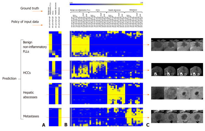
Figure 5.
Predicted probability heatmaps. The top color bar represents the classification probability of the model from 0 to 1, which corresponds to dark blue to bright yellow. A: Shows the results from normal four-phase input; B: Shows the results from different “phase cheating” sets as indicated in the policy of input data; C: Shows the representative examples. AP: Arterial phase; DP: Delayed phase; PP: Precontrast phase; PVP: Portal venous phase.

