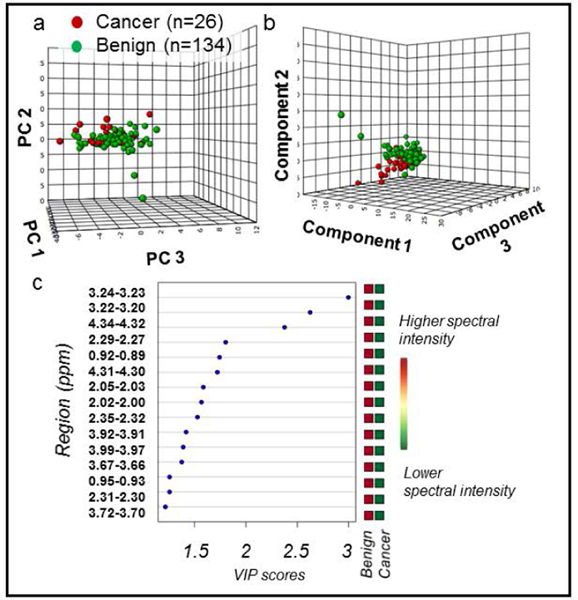
Figure 3. PCA and PLS-DA distinguish cancer vs. benign samples.
All MRS-scanned samples, benign (n = 134) vs cancer (n = 26). (a) PCA score plot with PC1 (40.4% of variance), PC2 (8.3%), and PC3 (6%). (b) 10-fold cross-validated PLS-DA score plot (R2Y = 0.33 and Q2Ycum = 0.18). Component 1 explains 35.1% of variance, Component 2 explains 11.1%, and Component 3 explains 5.6%. (c) PLS-DA VIP scores of Component 1 that are >1 and corresponding fold changes for regions are presented. All red squares in the right column indicate that each spectral region had higher intensity in cancer compared with benign samples. All spectral regions listed had VIP > 1 and were also significant in univariate analysis. Metabolites associated with each spectral region can be found in Supplementary Table S1.

