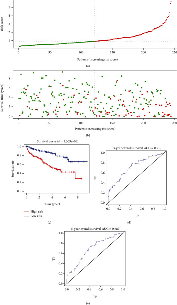
Figure 4.

Prognostic analyses of the high-risk and low-risk patients in the training cohort. (a) Risk score distribution of patients in the prognostic model. (b) Survival status scatter plots for patients in the prognostic model (green dots: alive; red dots: death). (c) The Kaplan-Meier plot (high-risk vs. low-risk group) for the training cohort. (d, e) Receiver operating characteristic curves showed the predictive efficiency of the risk score for the training cohort. AUC: area under the curve; FP: false positive; TP: true positive.
