
Figure 4. Plots of interactions.
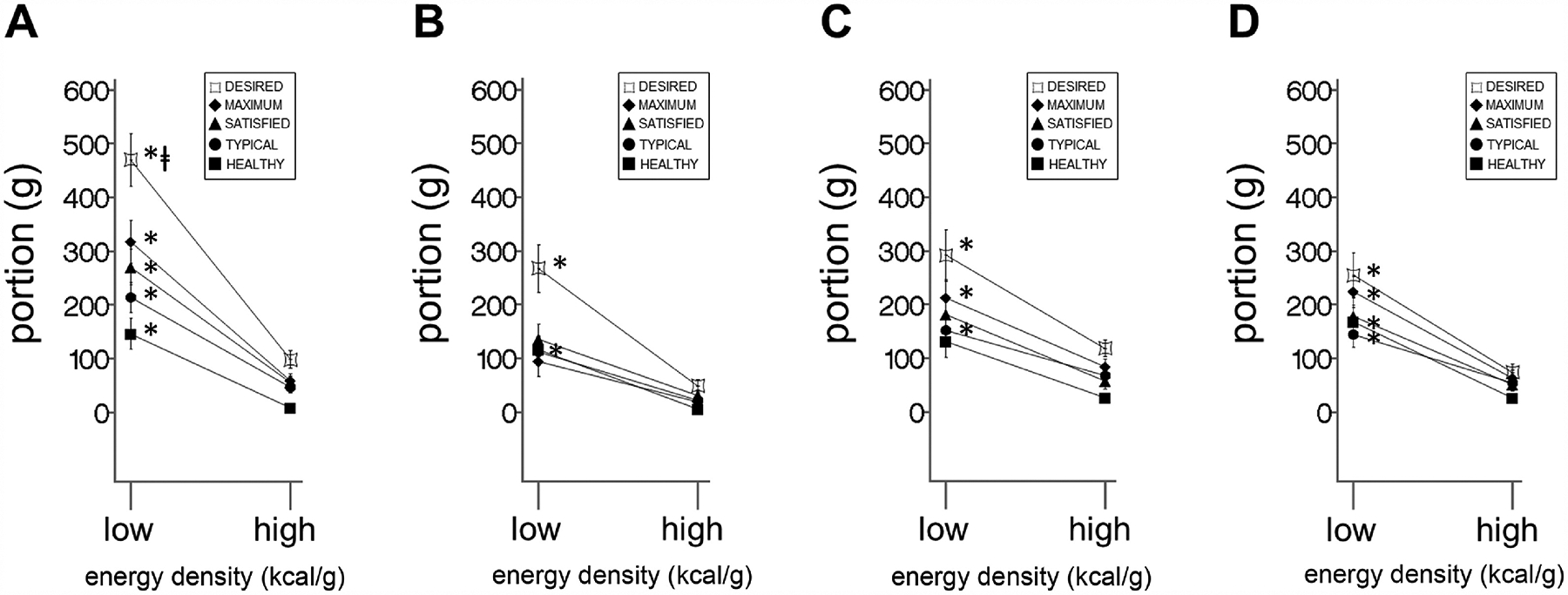
Line graphs of mean difference between sweet and salty portions, ± SEM, across two energy densities (‘high’ and ‘low’, x-axis) for each of the five eating contexts (lines) in (A) patients (n = 29) at baseline (B) patients at follow-up, (C) controls (n = 29) at baseline, and (D) controls at follow-up. See Table 3 for energy x taste interactions for each eating context. See Table 4 for eating context x energy x taste interactions. * signifies significant energy x taste interactions (i.e. the difference between sweet and salty low energy-dense portions being larger than the difference between sweet and salty high energy-dense portions) for a given eating context (see Table 3). ⱡ signifies significant eating context x energy x taste interaction, in this case meaning that in patients at baseline, the energy x taste interaction for the desired eating context is greater than the energy x taste interactions for the satisfied, satisfied, and healthy eating contexts (see Table 4).