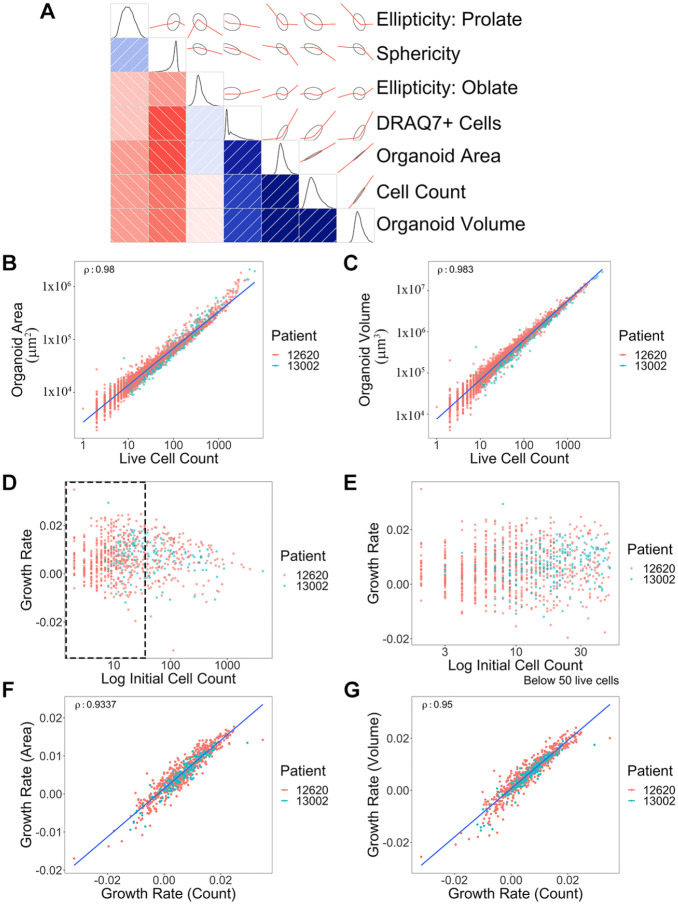
Figure 2.
Correlation of multiple measurements from 3D organoid imaging and growth rate calculations. (A) Correlogram was generated using multiple metrics from 3D organoid image analysis. Organoid morphological and cell features are presented as schematic drawings and overlaid with correlation graphs (red) between the intersection of two parameters. The Pearson correlation of seven metrics used to gauge cell growth and morphology is shown, on the lower triangular half of the diagram—those metrics labeled at the right. The intensity of the red and blue colors represents the strength of negative and positive correlations, respectively, with the directionality and patterns displayed on the opposite side of the diagonal (positive, +40° angle/blue; negative, –40° angle/red), with ellipses surrounding the red lines indicating confidence. Finally, density plots (black) along the diagonal depict the distribution of the data for each metric. (B) Correlation graph of organoid surface area and live cell numbers. Blue line shows a trend. ρ = 0.980. Each dot represents a single organoid. Each patient is distinguished by different color dots (red: 12620; green: 13002). y axis, µm2. (C) Correlation between organoid volume and live cell numbers. ρ = 0.983. y axis, µm3. (D) Distribution of growth rates based on initial organoid sizes. (E) Zoomed-in view of the size distribution graph (black dotted rectangle area in D) based on organoid sizes between 0 to 50 cells. (F) Comparison between area-based growth rate and live cell number-based growth rate. ρ = 0.934. Growth rate was calculated by linear model of log10(live cell or area) ~ time. (G) Comparison between volume-based growth rate and live cell number-based growth rate. ρ = 0.950. Volume growth rate was calculated by linear model of log10(volume) ~ time. Correlations were shown using Spearman’s rho (ρ) value. A total of 826 organoids across two different patients were analyzed.

