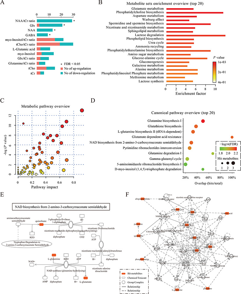
Figure 4.

Plots for data integration and biological function analysis. (A) The plot for the results of the vote-counting method. The plot summarizes the distribution of up-regulated or down-regulated of metabolites across studies. Red and blue bars denote the numbers of studies that reported that the metabolite was up-regulated or down-regulated, respectively. An asterisk (*) indicates an FDR < 0.05. (B) The plot for the results of metabolite set enrichment analysis. The top 20 enriched metabolite sets are shown. For each metabolite set, the color of the bars denotes the P-value of the hypergeometric test, and the ‘enrichment factor’ was calculated by dividing the number of uploaded metabolites (hits) by the expected number of matches. (C) The plot for the results of metabolic pathway analysis. Nodes represent metabolic pathways, the x-axis shows the −log10(P-value), and the y-axis shows the pathway impact. (D) The plot for the results of canonical pathway analysis. Nodes represent metabolic pathways, the x-axis shows the pathway names, and the y-axis shows the overlap rate of numbers actually matched from the user-uploaded metabolites (hits) and the total number of molecules in the pathways (total). (E) The plot for a canonical pathway. Metabolites, proteins and the interrelation in this canonical pathway are presented. (F) The plot for a molecular network. Metabolites, proteins and the interrelation in this network are presented.
