
Figure 3.
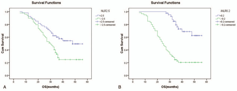
The Kaplan–Meier curves illustrate the cumulative survival time stratified according to (A) the level of neutrophils-to-lymphocyte ratio in peripheral blood (NLR) and the (B) level of intratumoral neutrophils-to-lymphocyte ratio (iNLR). In part A, the green curve represents patients with high NLR while blue curve represents patients with low NLR (P = .006). In part B, the green curve represents patients with high iNLR while blue curve represents patients with low iNLR (P = .000).