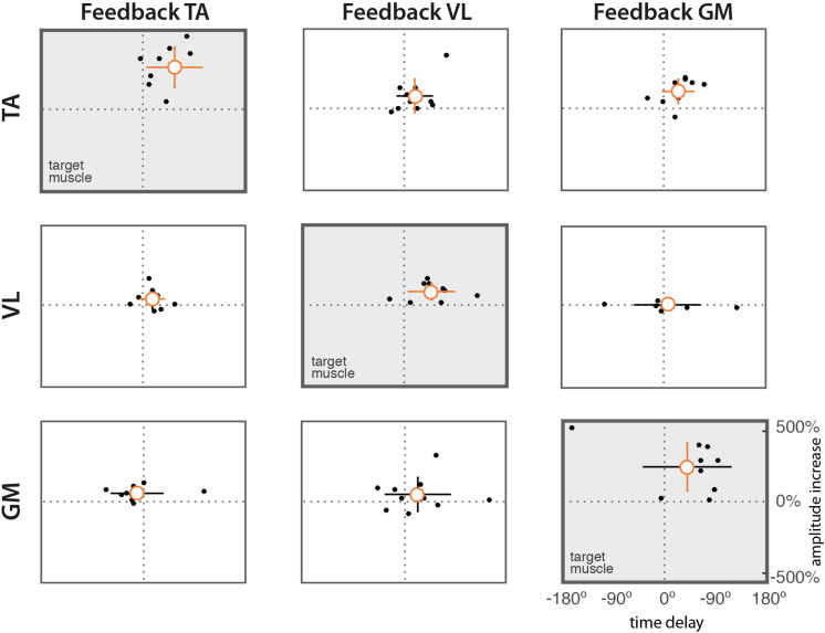
FIGURE 5.
Scatter diagrams of time delays vs. difference in amplitude. Dots represent mean values from individual subjects. The orange circle indicates the mean value across subjects. Vertical and horizontal lines indicate the standard deviations of amplitude and delay, respectively. Lines in orange indicate means significantly different form zero (t-test, p = 0.05).

