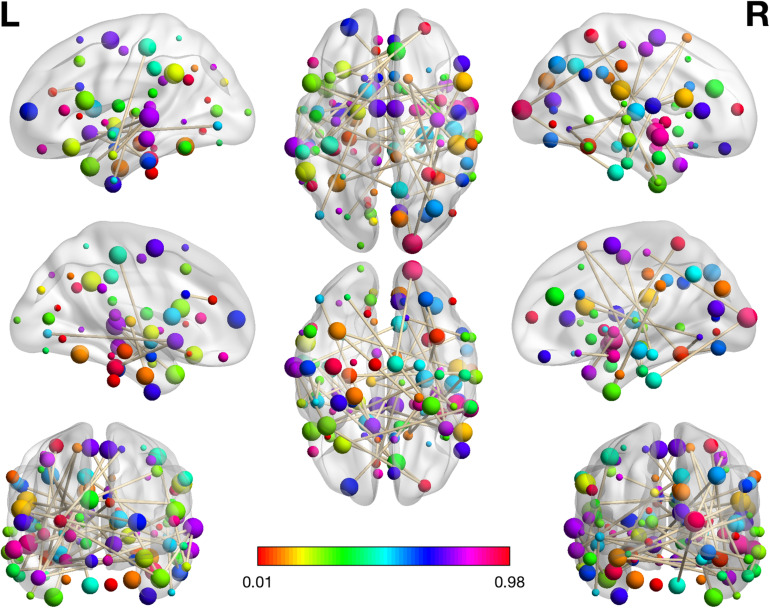
FIGURE 2.
The visualization plot of the selected 46 RSFCs. The color of the spot reflects the number of connections that the associated brain regions participate in. The larger corresponding value on the color bar means more connections are involved in the respective region. The brain networks were visualized with the BrainNet Viewer (Xia et al., 2013).

