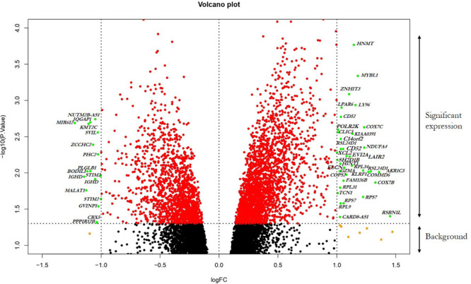
FIGURE 2.

Visualization of DEGs volcano plots using R studio. The plot compared the DEGs between FH patients and controls from the dataset. The representations are as follows: x-axis, logFC; y-axis, -log10 of a p-value. The p-values < 0.05 are in red dots, and logFC ≥ 1 and logFC ≤ –1 are in yellow dots; the significant DEGs with both satisfying values are in green dots and indicated with gene names. Black dots indicate the remaining genes present in the array that were not significantly changed. The genes that are upregulated in the array are on the right panel, and downregulated ones are on the left panel of the plot.
