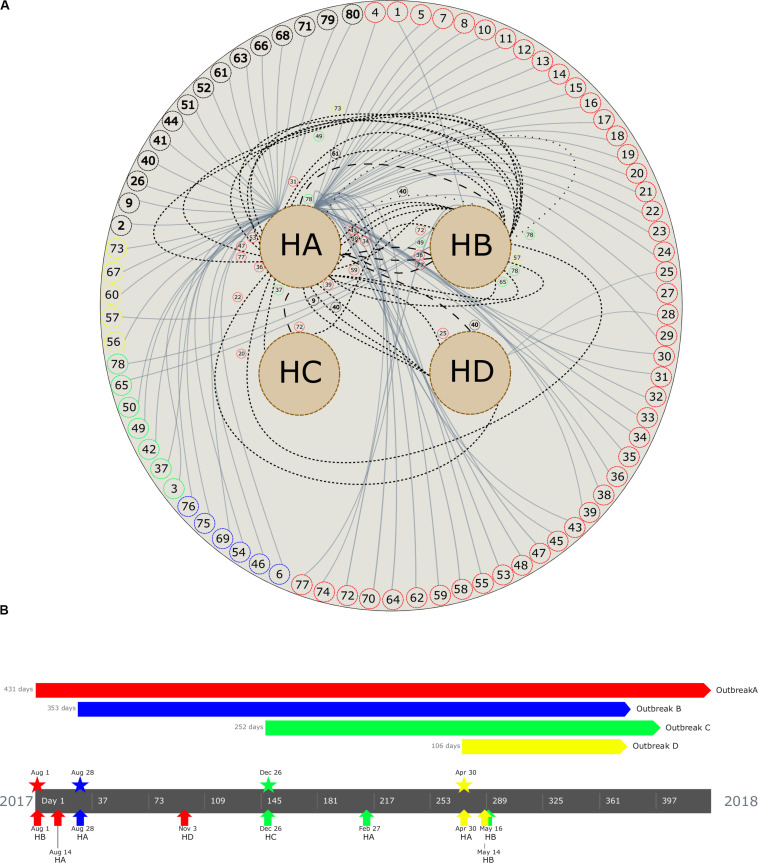
FIGURE 2.
(A) Patient movement networks between hospitals. Outer dashed circles indicate patient’s identification being red (patients with isolates grouped in outbreak A), blue (outbreak B), green (outbreak C), yellow (outbreak D), and black (non–outbreak associated). Inner dashed circles indicate hospitals (HA, hospital A; HB, hospital B; HC, hospital C; and HD, hospital D). Continuous lines emerging in each patient represent hospitalization, short dashed lines represent first movement among hospital, long dashed lines represent second movement, and spaced dotted line represents third movement. All patient movements are identified with patient identification. (B) Timeline of the four carbapenemase-producing K. pneumoniae outbreaks. Outbreaks are represented by colors (outbreak A, red; B, blue; C, green; D, yellow). Pentagons indicates the period of the outbreak, stars represent the beginning of the outbreak, and arrows up indicate the first outbreak’s isolate detected in each hospital (see geolocation on https://microreact.org/project/RZLItlMKm).

