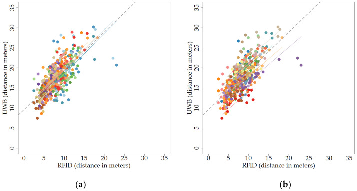
Figure 10.
Scatter plot of the relationship between RFID and UWB over a longer period of time, as average distances moved per hour for each day and animal, looking at the correlation within days (a) or individuals (b). Different colours represent different days (a) or individuals (b). Distances are depicted in meters. The dashed line indicates the regression when ignoring the repeated-measures variable, i.e., indicating the overall correlation. Dots represent individual data points. (a) Scatter plot of the relationship between RFID and UWB for different days; (b) scatter plot of the relationship between RFID and UWB for different individuals.

