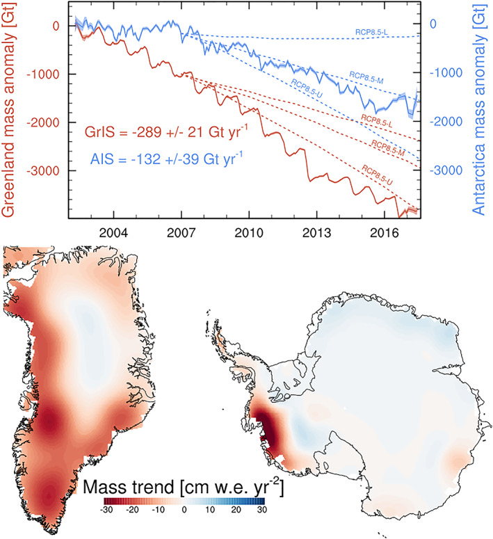
Figure 2.

Time series and spatial patterns of ice sheet mass changes as measured by GRACE (2002–2017, Wise et al., 2018). In the upper plot, the solid lines show the GRACE mass balance from Antarctica (blue) and Greenland (red), with uncertainties contoured in the same color, and the three dotted lines show the lower, middle, and upper estimates of ice sheet mass loss in the business‐as‐usual, high‐emissions RCP8.5 future scenario (IPCC, 2013). The numbers in the upper plot give the best linear fit for each ice sheet. The lower plots show the linear trend in units of cm water equivalent per year squared over the 2002–2017 period.
