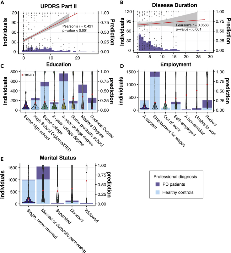
Figure 6.
PD Prediction in Groups Separated by Demographic Status
(A) Composition of PD patients with different reported UPDRS Part II scores and PD predictions when applying our model to the patients. The red line denotes Pearson's correlation between the self-reported UPDRS Part II score and PD predictions.
(B) Composition of PD patients with different disease duration (years since when they were first diagnosed with PD) and PD predictions when applying our model to the patients. The red line denotes Pearson's correlation between the disease duration and PD predictions.
(C) Demographic groups divided by the highest education level the participants ever achieved.
(D) Demographic groups divided by employment status.
(E) Demographic groups divided by marital status.
Histograms in (C)–(E) denote the composition of PD patients and healthy controls in the demographic groups. Predictions of our model in each demographic group are presented as violin plots and box plots. The red dots denote the mean prediction of our model for each demographic group.

