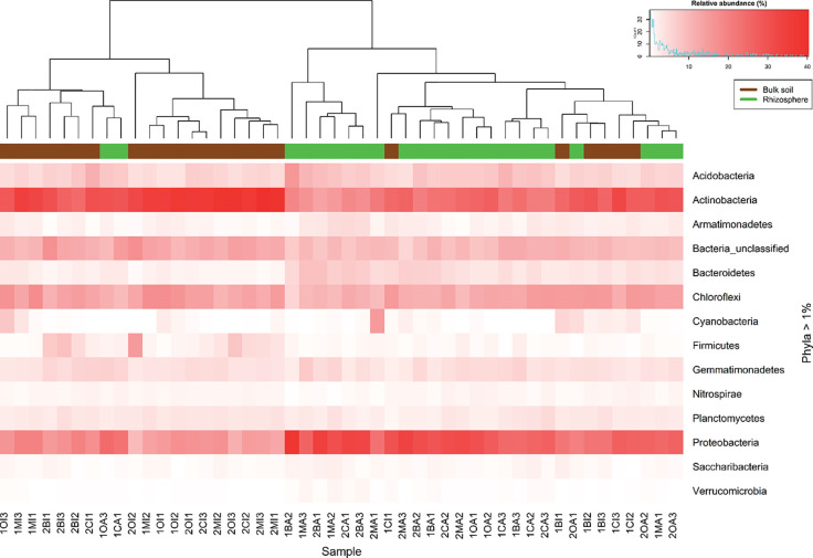
Figure 1.
Heatmap constructed using the relative abundance of the identified phyla in all samples. The intensity of red color represents relative abundance. Superior dendogram is the result of the clustering analysis using Bray Curtis dissimilarity index, each sample is colored according to their origin, rhizosphere (green) or bulk soil (brown).

