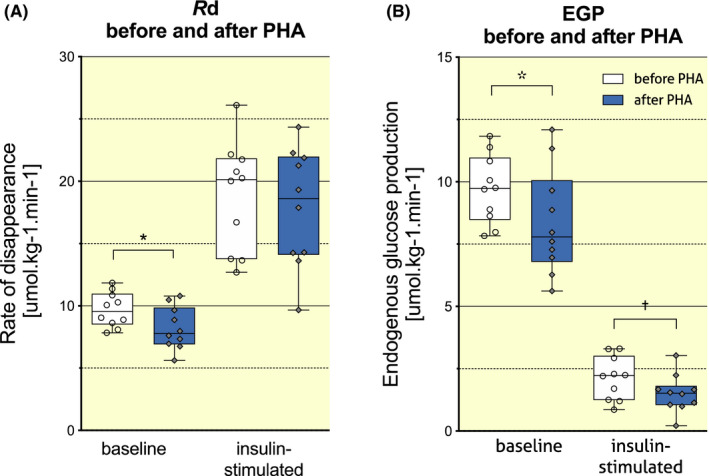
FIGURE 1.

Effect of PHA on insulin‐stimulated glucose disposal (A) and EGP (B). Data are presented in Tukey boxplots, where whiskers represent minimum and maximum values, boxes extend from the 25th to the 75th percentile and the horizontal line represents the median of the dataset (N = 10). Circle and diamond shapes represent individual data points. Rd, rate of disappearance; EGP, endogenous glucose production; PHA, passive heat acclimation. * denotes P < .05 and † denotes P < .01 for pre‐PHA versus post‐PHA
